
FLOW is an experience builder product platform developed in-house by DASS-Inc, a part of Illuminera group. With the increasing multichannel presence for content and marketing in the digital media communication industry, FLOW provides technology that allows various organizations and brands to develop digital engagements, digital ads, microsite, web-app or H5 in minutes without a single line of code. Its capabilities highlight the speed, modularity, capturing first-party data and performance analytics in real-time, seamlessly connecting offline and online marketing touchpoints with low cost and no tech team required.
FLOW
Understanding the demand for innovation in creating engaging channels and touchpoints in the saturated marketing sector, DASS-Inc embarked on the development and creation of FLOW in 2020. Joining the FLOW team right from its infant stages, and it being one of the biggest projects I undertook that year, beginning, I had the opportunity to take on various roles in different facets of the product's development and design from its first to the third release.
Working alongside amazing individuals and teams in the APAC region and New York, my roles include the handling of UX research and UI design of the platform, conducting user testings, working with the project management teams to guide the product design decisions within the internal and external teams of the front end and back end web developers. During the second phase of the project, I worked directly with the chief executives and managing partners in creating and strategizing use cases and demo experiences along with managing the project’s design assets for each releases and shareholders' meetings. The team ticked off some remarkable milestones, from the successful releases, securing partnerships and fundings, and now FLOW is officially live (you can view the site in Flowco.io) and heading towards its fifth release, with clients of Unilever, Heineken, Essilor and many more.
ROLE
UX research & strategy, UI design, Systems design, Project management and planning, Branding.
COMPANY
FLOWco & DASS Inc
Singapore, Vietnam, New York
2020
PROJECT CREDITS
DASS Inc Singapore team
Chief Executive and Founder: Wayne Cowden, Global Client Management Director: Edith Lim Creative Director: Justin Cheong and Kaile Ching, Creative Digital Director: Nuno Boggiss, Project Manager: Yinning Ng, Design Intern: Sabrina Kwee
DASS Inc Vietnam
Lead Developer: Phan Duc Minh and team
MobUX New York
Chief Executive and Founder: Martin Barrow
Project Background
With the growing demand in 020 channel in retail to increase engagement in multiple channels an convert offline to online and vice versa, DASS-Inc noticed that most agencies, in-house design teams and small businesses do not have web developers in-house & feel obstructed from developing engaging digital content & capturing first party data due to high cost, slow development leading time and complex data processing.
With the mission to make designing for a digital audience accessible to everyone, FLOW would enable any businesses, big or small to have a digital presence and multichannel marketing touchpoints.
The platform highlights these three main USPs where (1) The platform’s building blocks empower clients and their partners to assemble their own unique communication solutions in hours with no requirement for technical knowledge, (2) Instant data is generated from user responses providing real-time reports based on targeted objectives, with the ability to deep dive down to the exact department, person or consumer clients are interested in, and lastly, (3) although the platform is completely modular, FLOW has constructed a wide range of templates that can be edited and deployed into any department.


The FLOW
Project
FLOW is a web-app platform that is equipped with the technology and USPs that highlights the capabilities to create experiences and gather data analytics with no developers and codes required. As it provides technology that includes various innovative features in one single product, the progression from its first release towards the execution of its third, sure comes its sets of challenges. Both internally and externally from the product, design processes to the team’s workflow. These include the various fixes and updates in the product development and progress towards the goal of having the second and third release that includes the demo and use cases design and strategies.
The overarching umbrella of my roles is to ensure the effectiveness and guide design decisions on the improvements of the new and existing features of the product’s development within the design, project management, bearding and marketing and developers team and liaising matters on the front end and back ends.
FLOW Interface & Experience Deisgn
In building the FLOW platforms, we conducted various rounds of primary to tertiary competitors analyses (ranges from Wix, Canva, Webflow, Adobe XD and many more) along various internal and external users testings to look into each sets of the existing features and capabilities what innovations we could offer. We look into the creation of a multidimensional platform and experience builder that would be equipped with various features but also above all prioritise usability, accessibility and familiarity for the users.
Builidng various menus and numebrs of features, we design the wireframes using overarching control of "priorities". Among the gazillion challenges we facedin creating the wireframes of the platform, one of my biggest one not to overwhelm any user, especially new users with our loaded interface capabilities -even though that is one of our USP.
The following are some of the wireframes of the logins menu and dashboard and some of our other menu features (as I can't share all of our initial wireframes). One of the key feedbacks that I could highlight here was that we found most patterns of "confusion" from the internal user testings were on the lists of the inputs that one must fill in, compared to our competitors whose landing and login page feels simple. Thus even though FLOW would require these inputs to be filled in (that we already filtered through), we look into bringing this sense of ease in the interface, be it the layout or the elements, right from the login page to the availability of the direct tutorial at any point.


Archives of the wireframs of our FLOW dashboards and logins page heading on its second release
And the main star of the show, the FLOW's main editor interface with our demo sample in it. After gazillions of XD artboards, the following is the latest work of ours going into our second release, updating all the flaws and errors from the previous first release that highlights the new editor interface designs of the component and properties panels.
A little sharing session here, one of the main issue we had with or first release was the user’s navigation through the editor interface. Even though some senior designers could make use of the platform well, the lists and lists of the menu selections in each of the panels are rather overwhelming. Therefore what you are looking at below are the result of categorisation after categorisation of the menu features, taking out sub lists out and elimination of menus that aren't necessary on its own or to be shown in a particular panel immediately. And of course, the following is the result of the other lists of at least 100+ fixes that I couldn't show one by one entirely.



Main Interface's
Key Features
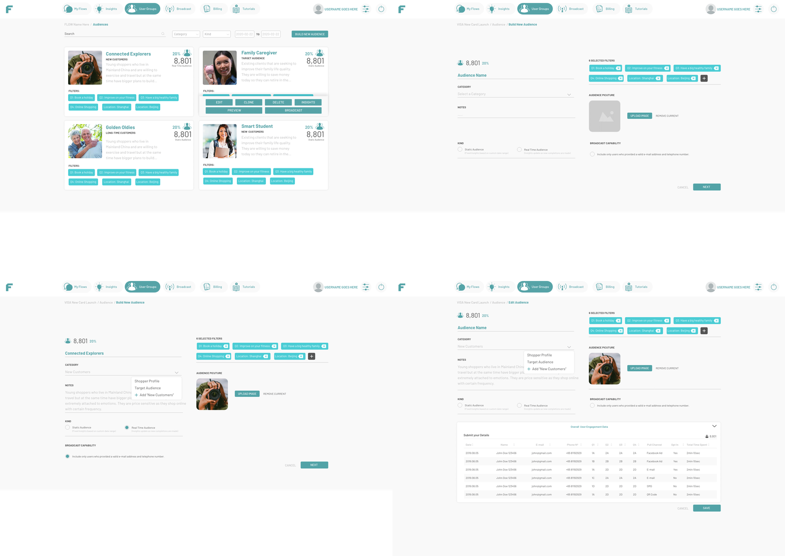
The following interface screens would highlight FLOW’s USP which lies in its multi-dimensional and customizable main features of multi-customisable sharing and publishing capabilities, gathering real-time insights, filtering and categorizing audience profiles and automated broadcasting.


Main Editor
Components
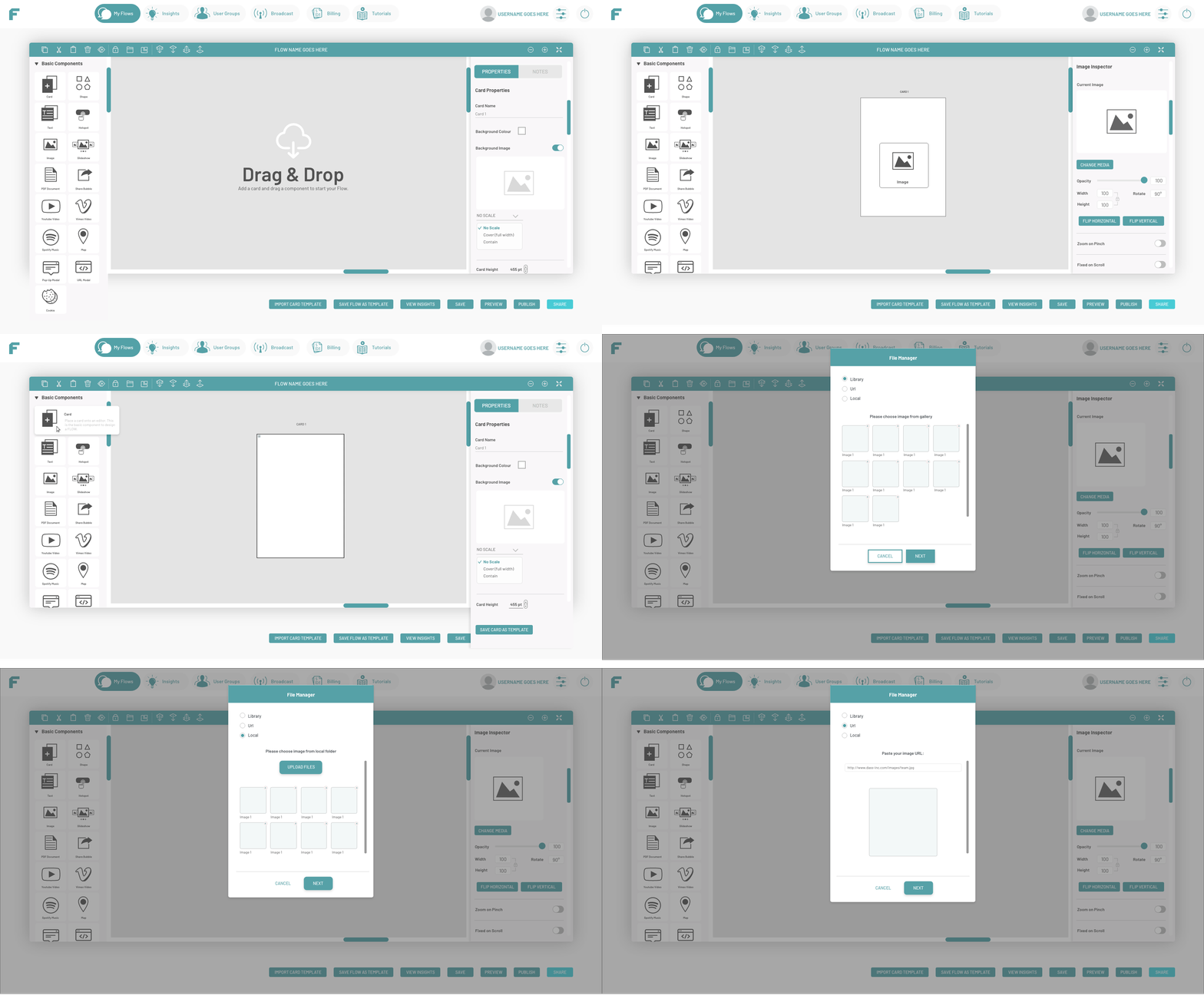
With all the hundred screens we have for our main editor components and properties, I would be highlighting this section with the main design updates of the platform; the menu design that most of them lie on these 3 particular areas (1) iconographies, (2) naming and labeling, and (3) description and usability. This particular learning point is when I overlooked our menus’s and icons design. As someone who is fairly familiar navigating throughthe platform, when we did the user testing results came out, most of them had issues with navigating through the menus. We relooked into the entire editor interface and the panels to restrategize what we could simplify and provide an “A B C explanation” approach.
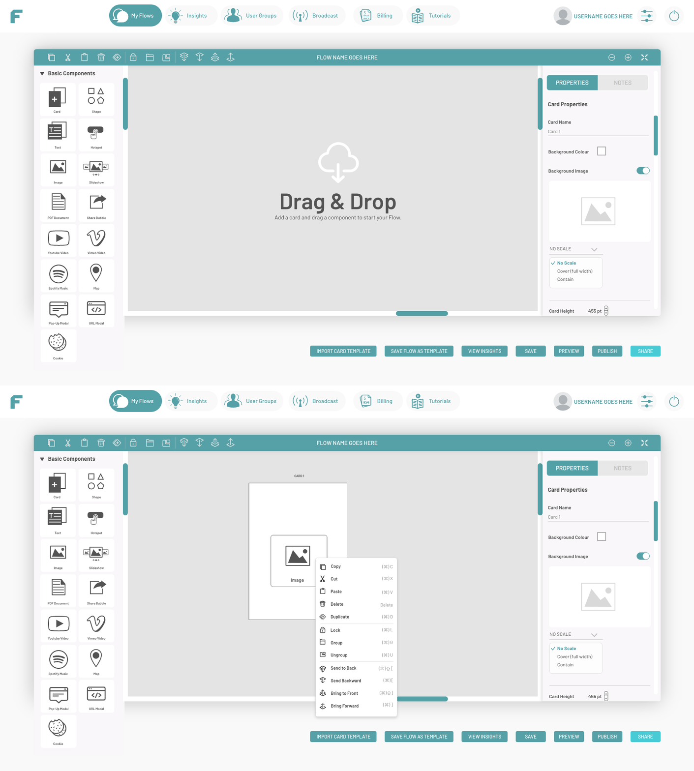
On fixing this particular issue, we decided to use this rule of thumb, that at least I created for myself, that I take a step back entirely from being the internal team pov to imagining ourselves or us designing for/as a 65-year-old non-tech-savvy grandma. You know, the classic duck taping a tv remote approach. And now we can see, how confusing the menus we had in our first release (sorry can't show the first release screens though).
We focused into fixing all of the iconographies to be very clear and straightforward (using graphics that are as clear as a road signage), so the user can grasp quickly what they are looking for. We also changed a lot of the naming into more familiar words rather than a certain specific "only-designers/developers-know" phrase, and one of the updates that I personally like was the provision of the hover details for each of the menus -that we can enable or disable.

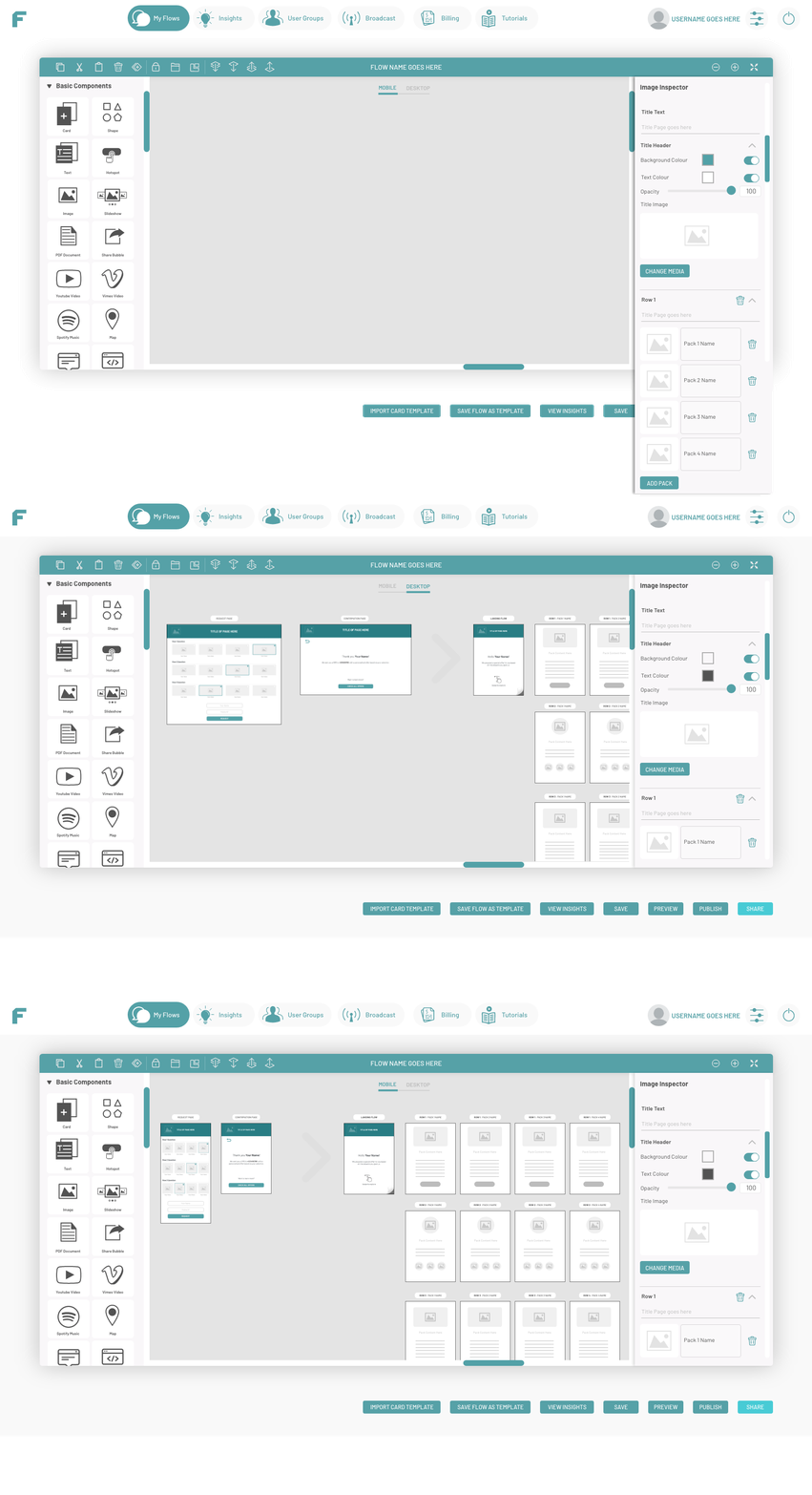
We also developed and designed a customisable interface options specially for teams that are working on specialised projects on many flows, this would allow a complete customisation like a personal design manager workspace or to cater for a specific flow that they would want to customise their prioritised features on. The following are the only screens that I am able to show in the following as this feature and interface design are still being further developed in-house.
FLOW Demo
Experiences
As briefly mentioned in the description sections. Building demos and use cases are one of the big portions of my role in the second phase of my time with the FLOW team. These demos will showcase FLOW capabilities and features on what kind of various experiences the platform could create. These demo series will also challenge the platform's capabilities testing out how far the back end system could sustain how much weight of the experience and data we put in. We take on various real clients and the ones we will approach to/ for a case study reference from various sectors of FnBs, entertainments, events, lifestyle products and many more. These demos are showcased in our new second and third release and was also the primary highlight in various shareholders meetings and other clients' pitches.
In building these demo it was not a mere random series of designs and testing. We plan out the exact frame and categories of the platform's features and strategised the experiences of each sectors that would highlight the FLOW's capabilities best. We section it from the experience triggers, functionalities and outputs and taking careful consideration of the shopper/customer journey like how we would design an experience from offline/online POSM to offline/offline and vice versa.
The main 11 categories of experience, features and functionality we want to showcase FLOW's versatilities are (1) Brick & Mortar Retail, (2) Omni-channel Activation, (3) Social Media, (4) Commerce, (5) Print and Magazine, (6) Events, (7) Sales Engagements, (8) Survey & Lead Generation, (9) Outbound (EDM / Messenger/ Social), (10) Search Engine Optimisation, and (11) Media Strategy. To view more of these categories, click here.
2
Behind
The Process


Categorisation and strategising FLOW demo to be built
On this particular demos and use cases and having the opportunity to work on various facets of the project’s development directly with the project managers, creative directors and design leads, I had the utmost learning experience on the importance of not only looking and focusing on how to improve the platform but to observe how the teams work as well -and how, voicing out issues with the internal workflow and system when we know it is no longer efficient.
One particular highlight was the reconsideration and re-strategising the team’s workflow especially with the platforms fixes and updates on the errors. When liaising things with the back end developer and providing updates and communication across teams, one of the thing we previously did was discussing in separate groups and would let the other department know what they would need to do, for instance, fixing errors, bugs and other glitches in the demos and platform, we previously would provide hundred of slides for each of these errors. However, this was not only inefficient and tedious but the web developer end would passively do as the slide mention without knowing the experience we are trying to build.
So we changed how we do things. Instead of telling them what is wrong one by one, we would have them in with us when strategising the demo and the features we want, so they would be able to understand from a both the pov of a customer and FLOW, so they would understand the areas they are working on as an entire experience instead of an “errors” one after another. We would have them understand the entire experience (refer to the next demo slides) of these input, experience and output and these would allow them to not only passively fixing errors but to actually improve the platform’s experience. Previously, we couldn't even get a proper 10 fixes in a week and we couldn't get the demos properly made in the platform. With this change of workflow and communication methods, we managed to tick of almost a hundred lists of fixes and improvements in less than 6 days.
Working hard and playing hard with the FLOW team
Design processes archives from buiding the platform and demos



FLOW Experience
Demo Samples
The following are the detailed rundown of the previously mentioned strategies of the triggers, experience and output. Building these demo it, did not only challenge FLOW’s capabilities to sustain the data input but it also exercises my strategic qualities in designing and formulating for a shopper journey POSM and marketings, understanding consumer behaviours and test out hypotheses and translating all of these into a FLOW demo experience.
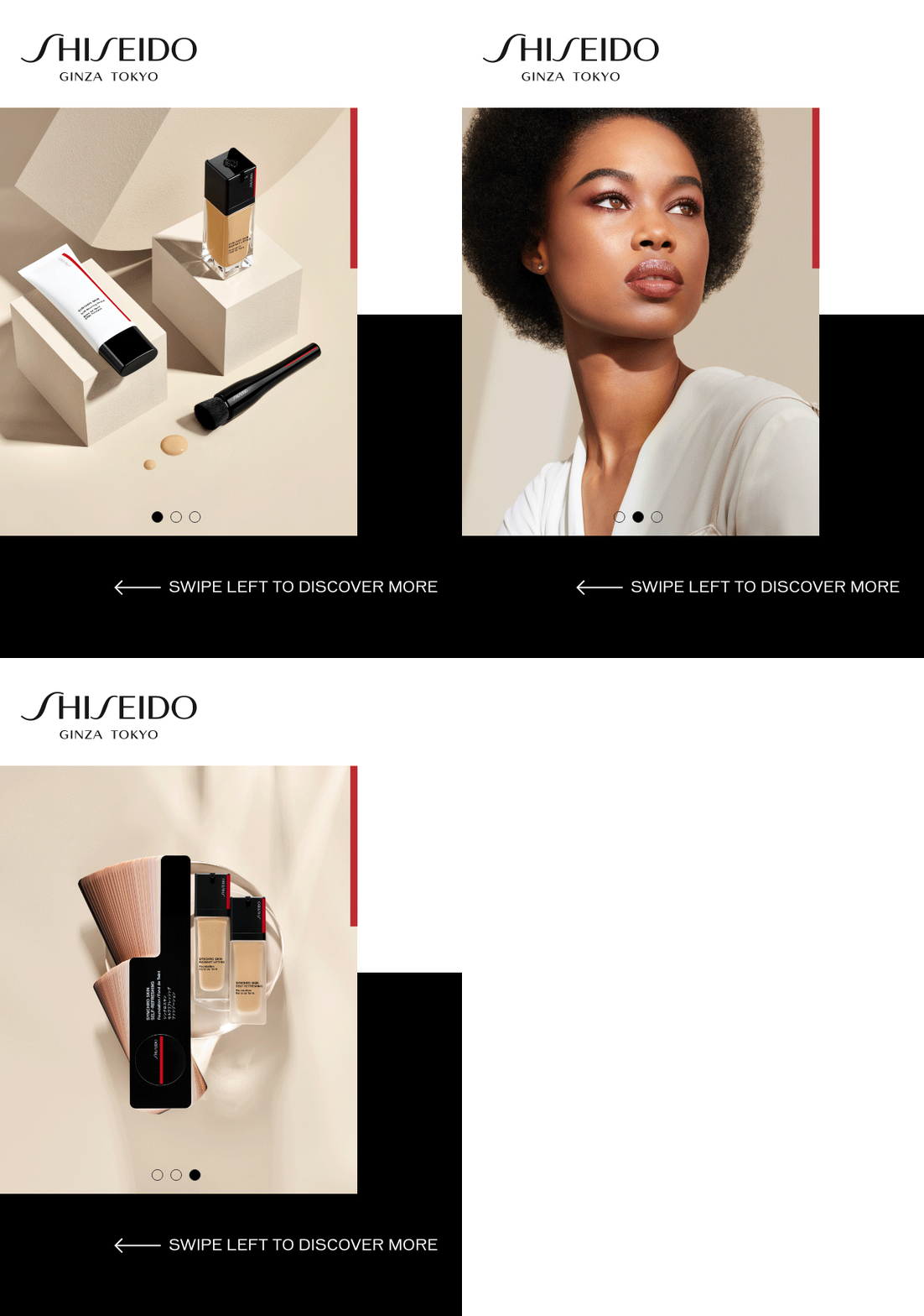
The following are some of the demos out of the 20 sets that we built in less than 3 weeks time. As also discussed the following slides were shown and discussed thoroughly with the web developers as a guideline to understand the FLOW platform from a designer and consumer's point of view. And on the brighter side, it was really exciting to see the developers in turn, after each discussion grew interest and curiosity on the shopper marketing strategies and principles.


Demo Experience
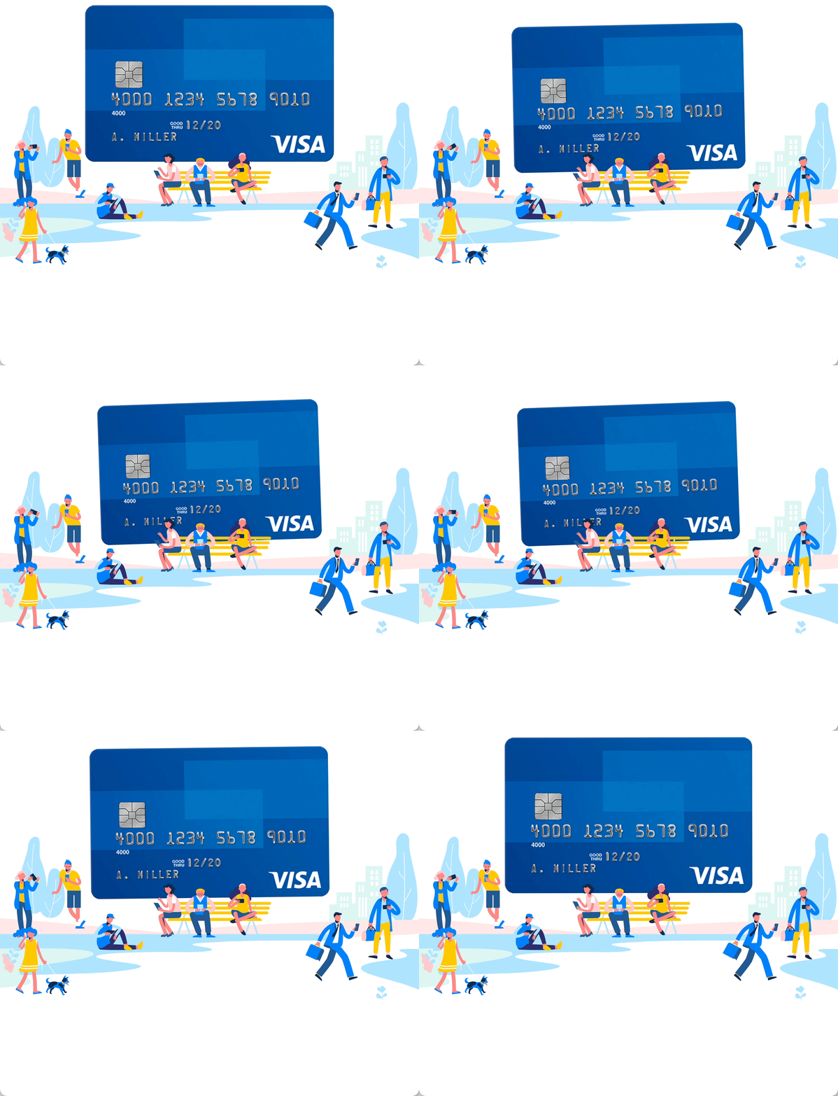
VISA
One of the very first demo we built was on VISA MasterCard. We wanted to create one of the more "popular" ends of a (new) product marketing in the category of banking services. Initially, we took on a which visa card are you approach of a quiz but later on changing it for a more exciting CTA for a trip to the Maldives as both are ongoing joined events. This experience would aim to encourage new customers to sign up for the card. The output that we highlighted would be the answer of the quizzes -that would in turn gather data for VISA on their customer's profiles on their preferences and likings and as well as an automated SMS promotion when they input their data. This also would VISA sales rep to contact them.


Demo Sample
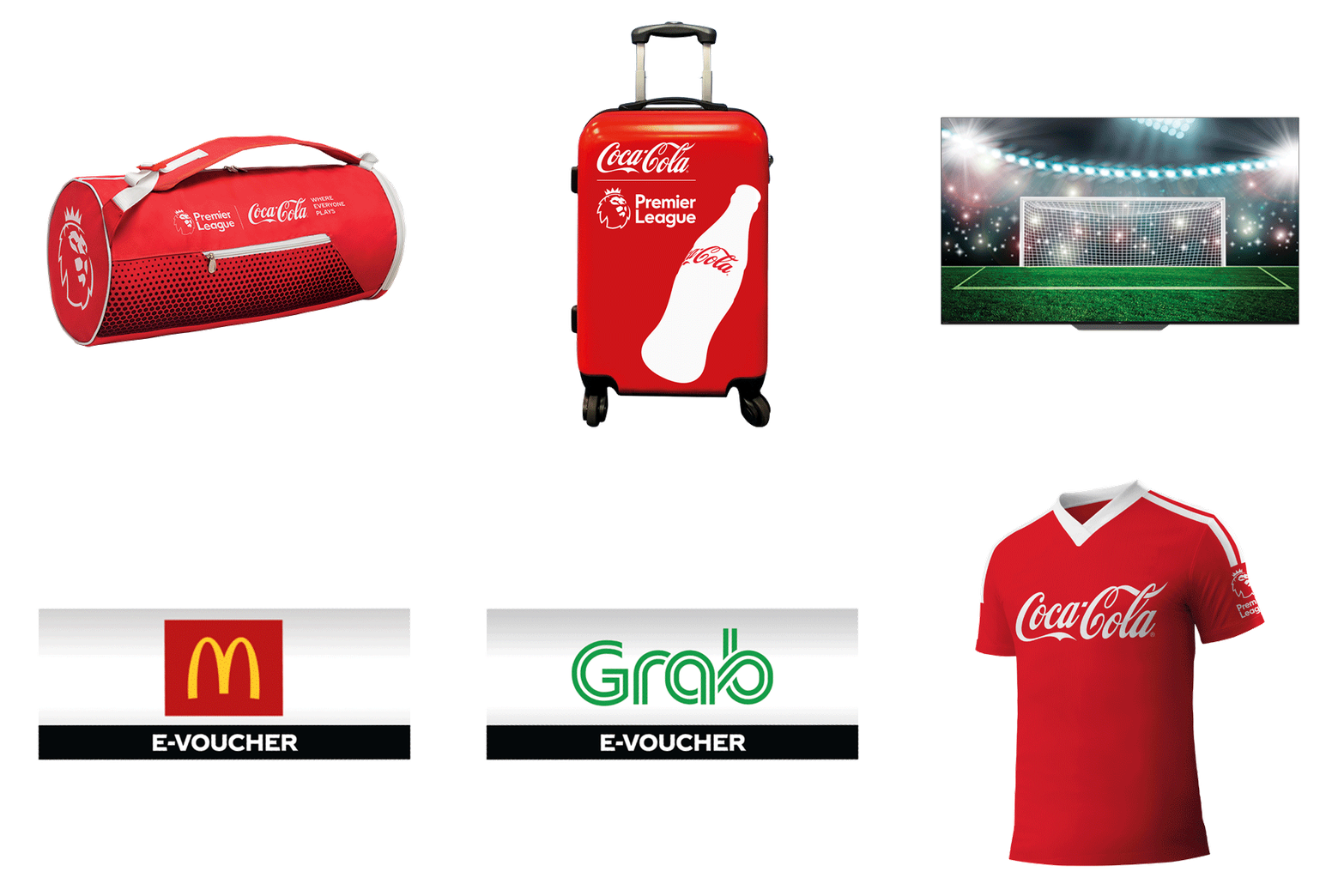
Coca-Cola
Showcasing a similar feature, we take on another classic FMCG marketing and branding case of quizzes to prizes. For this demo, we want to highlight the direct convenience of out features on FLOW for a similar Food and Beverage sector that would be able to be activated from a product's offline POSMs and packaging directly to the experience and would generate all of the necessary data outputs from the customer's inputs.


Demo Sample
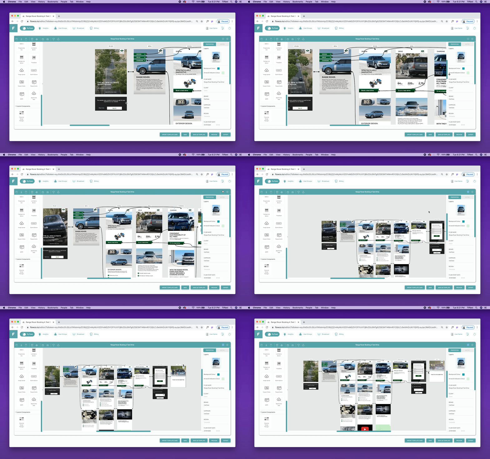
Range Rover
One of the demos that we invested our time formulating was for Land Rover's Range Rover, specifically targeting the retail and automotive industry. The goal for this experience is for customers who go to showrooms or their offline displays, would be able to be directed to the FLOW experience that would highlight the new Range Rover's features and would lead them to a book a test drive page and extend this touchpoint. And in turn, Land Rover would receive the data given by the customers and would be able to directly follow up booking submissions and send out other promotional advertisements and/or events.


Demo Sample
Formula 1
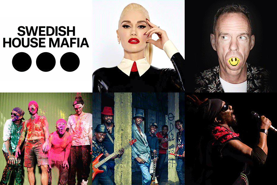
Taking on an onsite entertainment and event for brand promotion and event virality experience purposes, we took on the Formula 1 race where all of the quick highlights and links of the events from the ticketing race to other packages and entertainment details (which these 3 are the main advertised highlights we see across the island), we aim to have them fully digitalized through FLOW where any direct purchases could be made immediately. This particular demo was also quite a milestone for the FLOW team as it challenged the platform's capability where previously in the first release we could on built less than 100 links. With the push of this formula1, we managed to have a very stabilised platform with the link number that goes beyond that and was successfully showcased in the shareholders meetings.



Demo Sample
Huggies
Taking on the demo for one of DASS primary clients, Huggies from Kimberly Clarke is for brand education and e-commence marketing and retail purposes, we see that a to of lifestyle product's would require such information on their hand conveniently as an extend 020 touchpoints especially for new and potential customers. Specifically, on Huggies, there provide a wide range of product categories, especially with the various age group categories of the babies. The experience would provide the highlights and key USPs of each products that would guide parents and buyers in purchasing what they require and also allow them to conveniently browse the "digital catalogue" in-situ.




Demo Sample
House Beer
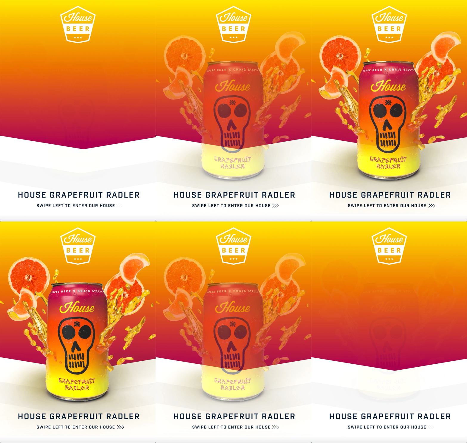
One of the highlights of our demo and experience building was an exciting partnership we had with the Mobux's New York team for House Beer's new product launch and event. I had the pleasure to work directly with Mobux's chief executive to lead this particular demo. House Beer was having a new product launch and activation with Craig Stecyk III as the guest and this demo would cater for this product's activation where the full highlights and locations of the event would be immediately available with FLOW with just scanning the product packaging and other social channel links. One could also redeem a free beer directly by filling in the quick details. These highly beneficial data would be able to be gathered in the platform and have an automated response set to be sent out directly the customers' submit their input.


In Retrospective
/Afterwords
FLOW, being one of my biggest projects in last year, being grateful for the opportunity, chance and trust in this product platform are a complete understatement to me personally and as an individual and designer. I guess with the courage of saying the 3 lettered words, a yes to what i used to call scary offered opportunities (talking about imposter syndrome), taking on responsibilities that you did not know you are able to, I am very grateful to have such a wonderful team guiding me a long the way and are very open to ideas, experimentations and explorations to develop the platform.
If anything, FLOW was truly one of the greatest learning experiences not only within the UX, UI or strategies realm but it exercised critical thinking and dynamic approaches, problem defining and solving, research methods and testings, and definitely, the biggest takeaway is the collaborations among our very dynamic teams. Working on FLOW was almost like raising a baby witnessing what you worked on from its infant stages, working on various innovations with the team, to see it grow into what it is now Flowco.io.


