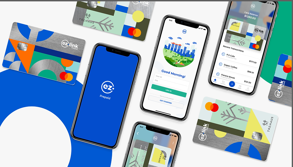
Previously Fevo Prepaid Card, EZ-Link Prepaid Mastercard relaunching projects taps in a new product initiative of an integrated expenses management system and platform, along with a new series of prepaid card designs and branding. Aiming to strengthen its brand positioning with SMEs as the main target market, the new business payment solutions would provide a more seamless, efficient and transparent expenses management within an organization, cutting the average processing lead time by 98% .
EZ-Link Prepaid
Mastercard
The EZ-Link and SuperUnion team engaged and collaborated with LASALLE college of the arts to take on this UX/UI, system design and branding project. Marking the first project i take in for finance and banking related field, it was a very exciting project analyzing various SME organisation's expense management processes.
The process includes conducting user behavioural and market research, translating them into the essence and foundation of the new product’s initiative of the expense management platform and system highlighting the automated mobile cashless and paperless process with real-time visibility and control. This cuts in average processing lead time of end-trend expense submission to approval from 90 minutes to only less than 5 minutes. Encapsulating the whole re-launching project, we produced a series of the prepaid card's design re-branding strategies that would translate a sense of excitement and pride for the users through the vibrant designs and customisations features.
ROLE
UX research & strategy, UI design, Systems design, Branding and Identities
COMPANY
EZ-Link Pte Ltd, Singapore
Design Bridge and Partners, London
2020
PROJECT CREDITS
EZ-Link Pte Ltd and SuperUnion Singapore teams and LASALLE College of the Arts Design Communication mentors


Project Background
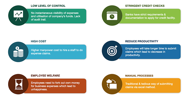
Every company, regardless of size, has its own expenses from offline to online that varies from; office and petty cash (courier pantry, stocks & office supplies), local and overseas travels (accommodations, flights, taxis and fuel), business entertainment (meetings and luncheons) and recurring online expenses (subscription plans or similar).
However, most companies apply manual processes like an excel-based method to manage their expenses which comes with its own very issues and great inefficiency. Companies have no immediate visibility & control over business expenses whereas employees would spend unnecessary time managing receipts and filing expenses in excel spreadsheets. And lastly, Accounting teams have to reconcile expenses manually. Through the data gathered on these issues, we categorise them into the following six to layout the mains specific focus and interventions we could provide
Archvies from the disucssion briefing slide with the Ez-Link and SuperUnion teams
Throughout discussions with the teams, we also find that there is a lack of "motivation" in employees/users to use such prepaid cards and especially those issued by the company as most of them mentioned as unappealing and the majority of them indicated this toward the aesthetic means. The EZ-Link team were looking at how to position the brand and to make the users, across all the organisation of the company would have this "sense" of pride and excitement in using the card and enthusiastically take the new EZ-Link expense management system as their own "new normal" which eventually increase the brand equity.
The "Problem"
Overview
Previously called Fevo Prepaid card from 2009-2019, in 2020 EZ-Link Prepaid Mastercard take on a re-launching project, introducing a new product initiative of an integrated expenses management system and platform, along with a new series of prepaid card designs and branding, strengthening its brand positioning with SMEs as the main target market,
Understanding the problems and situations faced my various SML organisations in their expense management that utilises the manual expense claim process and greatly affect their employee's welfare, efficiency, and company's lack of imidiate control and visibility, this relaunching project would provide a new business payment solutions that would seamless, efficient and transparent expenses management. cutting the average processing lead time of end-trend expense submission to approval from 90 minutes to only less than 5 minutes.
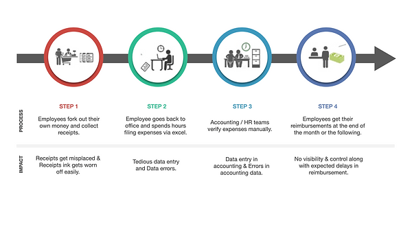
Analyzing the inputs and comments from employees and secondary research materials on various manual expenses claims in various organisations in Singapore. The system would cater for all SML companies but we specifically put SMEs as one of our largest stakeholders and target market due to the enterprise’s structure and organization of expenses. The following is the main SMEs manual claim process. we mapped out a streamlined diagram on the steps of claims along with the impact and implications to each of the employees across the organisation from end to end. Through this we would be able to see how to see the exact key moments to tap in specific solution(s).
Archvies from the disucssion briefing slide with the Ez-Link and SuperUnion teams
Project Pathways
& Approach
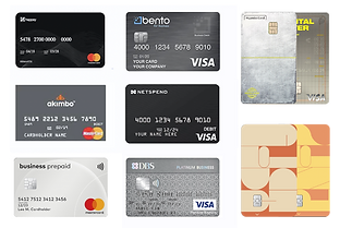
In approaching the sets of issues and key moments of the current process, we looked into the current market of our product's primary, secondary and tertiary competitors. In regards to the system and app platform, we studied most of the following apps such as Nextspend, Bento, Happay and aikido which provide a similar service to what we would like to provide and OCBC and DBS banks that we deem as an ideal platform -in which one of the features we observed is the categorisation of the information per segment and the UX in navigating the app without the feeling of information overload. These two platforms provide a welcoming and serene ambience amongst most of the banking apps majority used in Singapore.
Looking into the card branding and designs, as the EZ-Link and SuperUnion team have pointed out since day one, for most prepaid cards, especially for business use ones, the designs have these classic formal graphics patterns along with neutral colour choices that has a very serious feel to it -that most of the employees deem as unappealing.
We looked into various card designs and were very drawn into the last 2 in the following -that have a much contemporary feel. The first is from Korea, where among all the prettier card designs that they have across the country, this particular one from Hyundai Digital Lover card has full-fledged lifestyle campaigning narratives and initiatives that lead to a strong brand positioning among the age group of 25-35. One of the main attractions of the card is the play of textures and colours without looking too childlike. The second would be and the visa MBTI card design customisation strategy, tapping in the excitement of personalisation, catering to each of the user's MBTI tests. Looking at these 2 cards, branding-wise and strategy-wise, are something that we thought of challenging ourselves and EZ-Link to look into.


Archvies from the disucssion briefing slide with the Ez-Link and SuperUnion teams
Understanding
User's Profiles
and Routines
Through various sets of interviews and preliminary testings, we created the "classic" user persona for each of the main employees' categories of profiles. As much s we started with the "classic" sets of data such as their profiles of the biodata and lifestyle, it was only until we gathered the entire sets that we realized how much their lifestyle and day to day basis in their 9-5 are affected by these expense claims.
It didn't appear immediately when we had casual talks slash interview about their claims but soon one tiny conversation on payment issues (not having enough cahs/balance/forking their own cash, etc), to losing the receipt, to actually forgetting to claim, to all of the errors in the reports, the conversations slowly emerged into the long dscussions of the issues of the manual excel-sheet based process. Just by losing one single receipt on an important purchase, would take one employee's hours to sort the claims out. After finding these insights, we did a conversation mapping to take the specific patterns of keywords and did the rundown of the specific pain points of each of the employees in respect to their jobs.
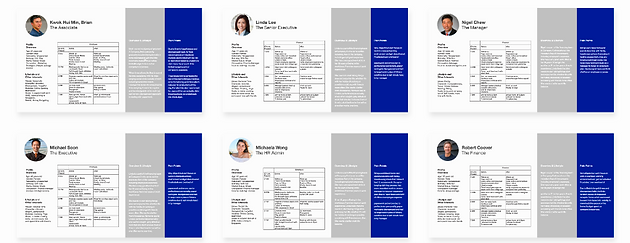
Snippets of the User Persona and Profiles. Blurred as they are case it is sensitive.
Taking in these information, we made a table on a before and after schedule. ABsed don't he insights and our hypothesis and draft plans of the system, how would their hours be on a particular day/s of the week when they need to to expenses claims. Ther result was even very obvious by contsrating amount of word count in the before compared to the after table. TMAking this schdeuer timeline also informs us on when and how they are going to use the app along with the necessary features of navigation that would cater to their pain points and goals. The above are the main six employee's persona we did for all of the stakeholders involved in the system. Excuse the intended low quality due to some information labelled as confidential within the teams.
The New Expense Management
System
With the analyses and the insights on the expense management, we laid out a new product initiative and business payment solution; a curated and innovative automated and mobile expense management platform that would enable real-time visibility & control and above all, cashless & paperless. An integrated platform that links employees’ corporate Prepaid Mastercard to the administrative portal in a click end-to-end streamlined workflow from submission of expense to approval. The following is one of our drafts when mapping out the touchpoints and the flow for the entire process and reimagining the flow with some dummy blocks of layout and designs.
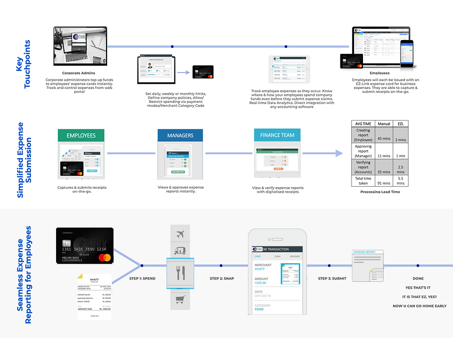
Archive of the sample draft of the EZ-Link Prepaid Mastercard System and Touchpoints system map from the meeting briefing slide before proceeding with the app design process
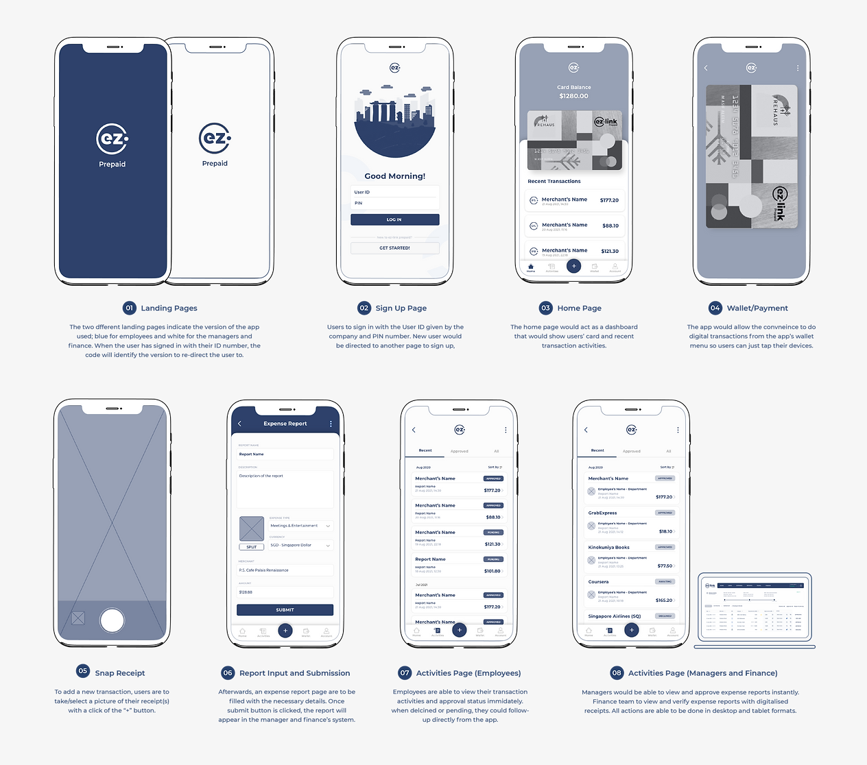
The EZ-Link
Prepaid App
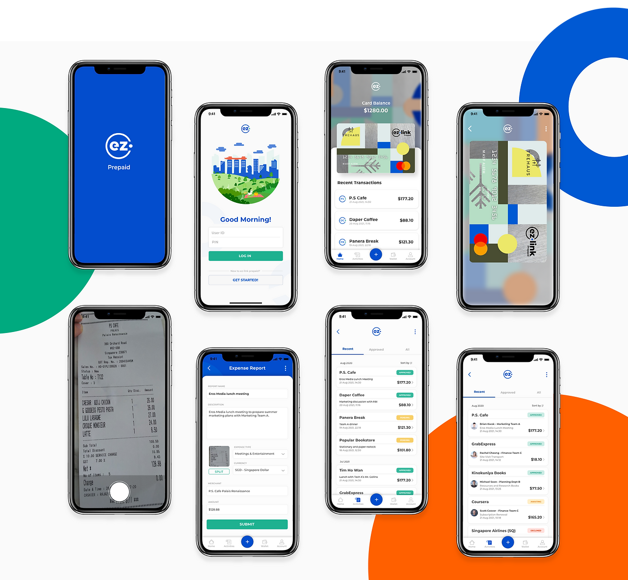
The EZ-Link app would be the hub of the employees, managers to the finance's transaction payment, submission to the approval process that would be seamlessly and conveniently ready by their fingertips. The app highlights the key designs of e-payment, direct expense submission and management. The following are the latest prototypes of the app.
The following are some of the wireframes of the main screens (that we use as the main highlight of our product's user journey) for the dashboard transaction, payment, snaps, submission and approvals. We created an app and system that would enable the convenience of this process without using an overwhelming amount of menu pages. We gathered a lot of UI case studies and the flow of experience from banking apps, scheduler apps, fellow competitors management apps, lifestyle apps and also the interface of grab and gojek that we deem as one of the more convenient ones to view transactions with the cohesive and non-overwhelming graphic elements across all menu and features -even though each of their menus contain a lot of sub sets of information.
One of the considerations we had was if we should our a product platform similar to a banking app, so every single little information would be just within your reach and like a multi-functional app and all that. We did take UI references from the banking app but soon we realized, it would only shy away form that "convenience at your fingertip" aim of the system and the brand's objective. As much as we wanted equip the app with loads of features, capabilities, and information, doing the mentioned approach would actually overwhelm our users with a lot of menus as we should declutter on what's less of a use for the purpose solely of the expense management of transaction, submission and approval.
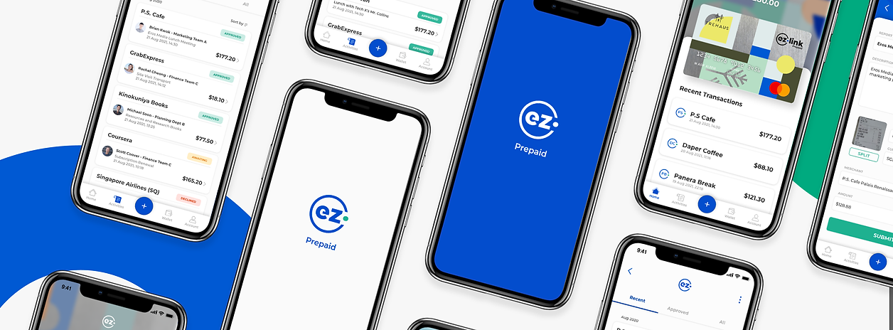
Translating the wireframes into the app prototype, we look into tapping in the colours and the excitement that we want to translate -and how do we incorporate the "iconic" EZ-Link blue-green dynamic across while introducing secondary and tertiary colors. The introduction of the new UI, colour schemes and graphical patterns would aim to create this sense of excitement for the users. But of course, as we want the interface to not have any visual clutter, we make use of the graphics from our card's patterns. Especially for the status of approval for both the employees and the manager & finance sides, we tried out a lot of different hues, brightness and saturation for the main red green and yellow that won't cause any "alarming feeling" (like a traffic light) but still maintain the boldness and full clarity of the approval status. And lastly, after various internal user testings, we settled with the following prototype.
EZ-Link Prepaid
Mastercard
Designs
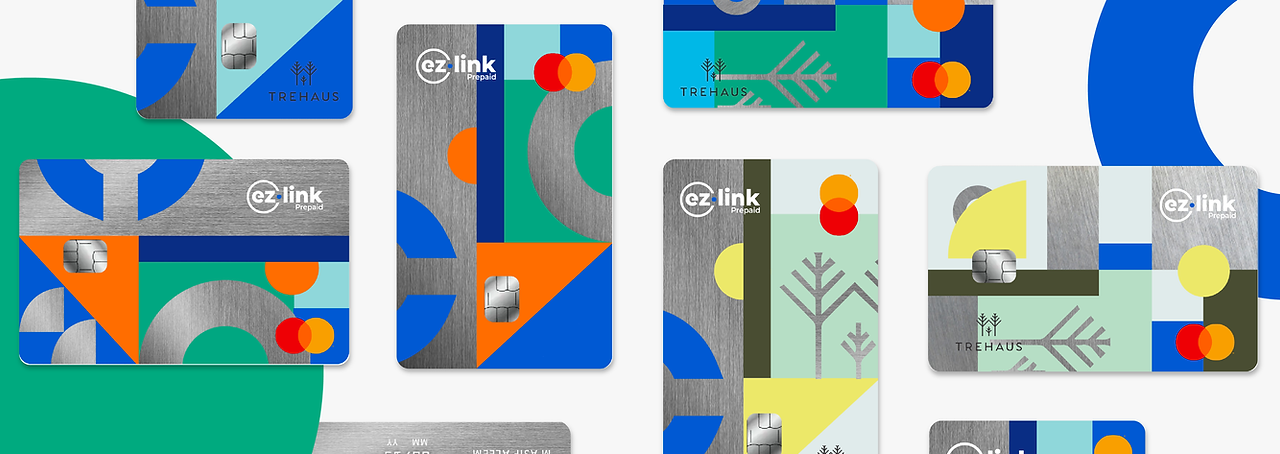
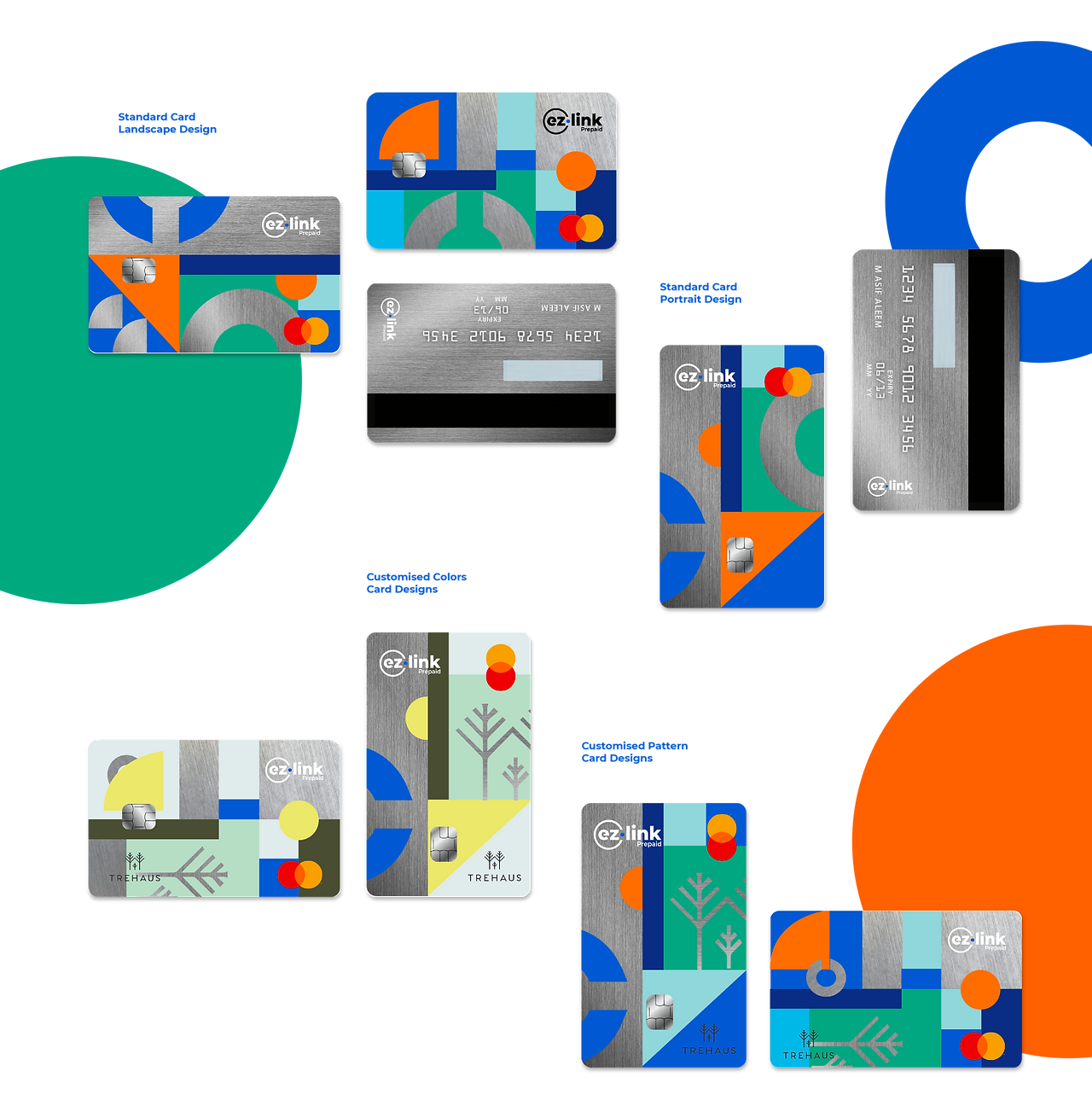
As briefly discussed in the previous sections, one of the goals that both the EZ-Link and SuperUnion want to challenge is the translation of the emotions of the users' towards the brand -both in the use of the card and the system. We want to take on a design direction that is much more vibrant, creating this feeling of joy, excitement and in"pride" for the users, for the card owners do not just simply look at it with a dull feeling of it being the "company's card" but have a personal sentiment towards it.
The new card designs we introduce would have 4 choices of designs, this would be the standard card design of the patterns and colour schemes below that would be available in landscape and portrait formats. The third one would be the given patterns and EZ-Link colors with the addition of the company's logo and graphics to the card. Lastly, the full-on customization initiatives for all companies to use their choice of colour/company's trademark colours with the logo and patterns. And for all of these would be available in the choices of portrait and landscape.
The initiative of portrait card designs, what we had in mind on how we would like to make our cards, even with customisation features would stand out and immediately recognized. By this time the portrait card is not a stranger in most countries but definitely not so common in Singapore and the prepaid card designs. Therefore, we thought it would be ideal for a subtle change to make a statement.

"If I were to own one of these cards, I would be very delighted…”
Creative Lead, SuperUnion
In Retrospective
/Afterwords
"The App's interface looks very "happy" and vibrant, we really like them!”
EZ-Link Pte Ltd teams
Taking on this project with the Ez-Lnk and SueprUnion team, it was honestly one of the most exciting yet nerve-wracking. Especially taking on banking and finance area for the first time, it was very enriching to understand how most employees and SME do their expense management, from their spending, preference and behaviours, and how the manual process that they have been using, even though if something serve its purpose, it does not guarantee its effectiveness. And to see how just a change in a sytsem, that is rooted from behavioural research and catering to their specific needs, would change the entire SMLs could save for their employees to cater for the more necessary things instead of stressing out on their expenses.